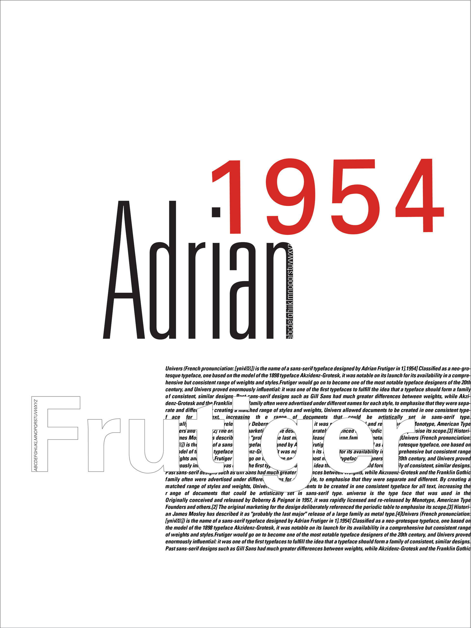
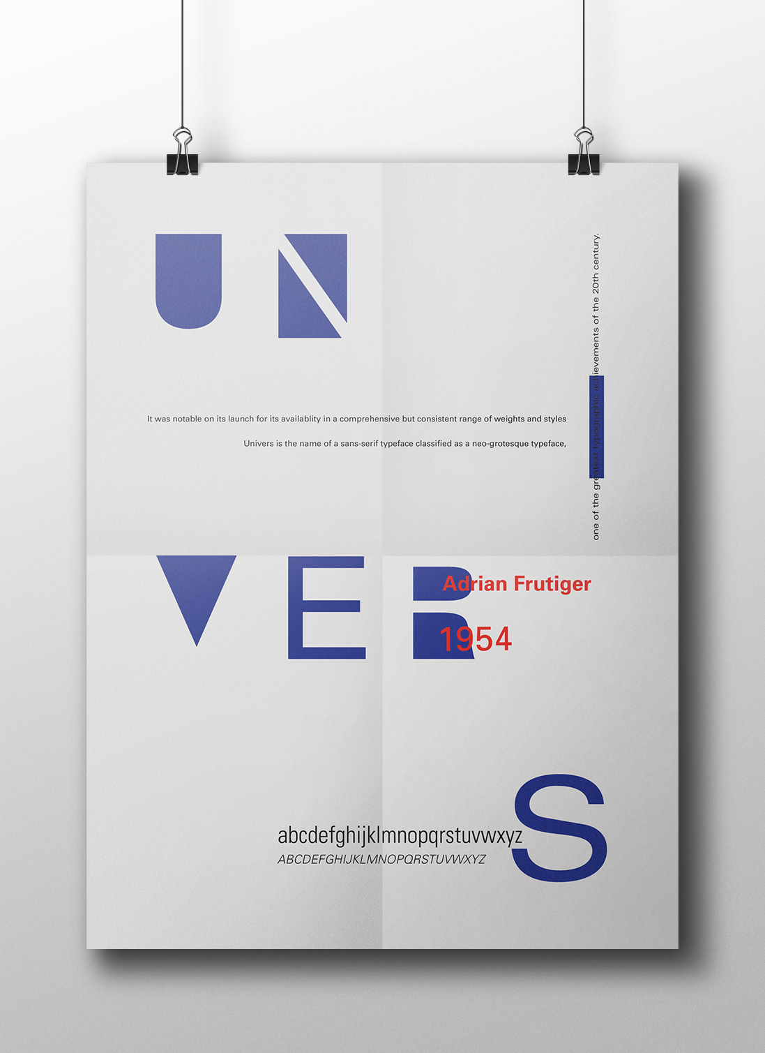
Adrian Frutiger was a swiss typeface designer who designed the univers font family in 1954 containing variations of weights and styles.
Adrian Frutiger was a swiss typeface designer who was born in Switserland and moved later to France and got his education there, he designed the Univers font family in 1954 containing variations of weights and styles.
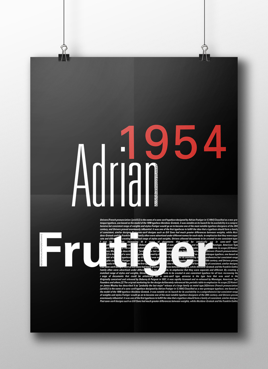
The color Red is the exact red used in Switserland flag where Frutiger was born. And the Blue in the design is the exact blue in France Flag where the Designer got his education.
The Slop in the design refers to Frutiger's character because he refused to follow the formal swiss design school and he insisted on being different in designing his unique sans serif typefaces such as univers, avenir and frutiger.
The design includes the alphabet written in different variations of the font family variations that he designed to show the difference and consistency in Univers font family.

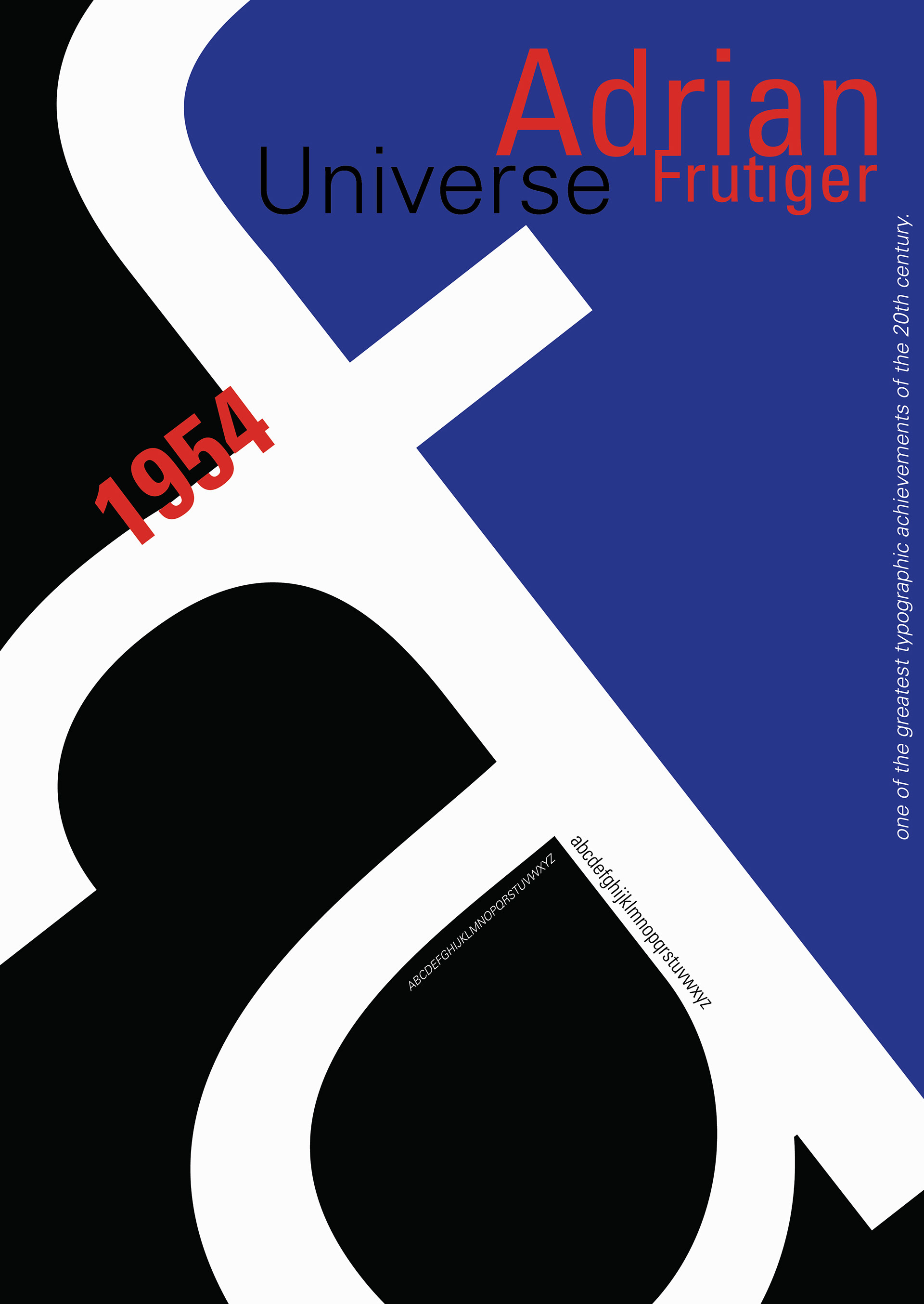
Adrian Frutiger was a swiss typeface designer who was born in Switserland and moved later to France and got his education there, he designed the Univers font family in 1954 containing variations of weights and styles.
The color Red is the exact red used in Switserland flag where Frutiger was born. And the Blue in the design is the exact blue in France Flag where the Designer got his education.
The concept in this design is based on the negative space in each and every letter and how it was considered in the design process that Frutiger made, and the way he didn't just stop at focusing on the letter but also he gave attention to the way the empty space will eventually affect the reader.
The importance of that negative space was the concept of this design.
in addiction to using variations of weights and styles of the font family " Univers "
including the alphabet written in different variations of the font family variations that he designed to show the difference and consistency in Univers font family.
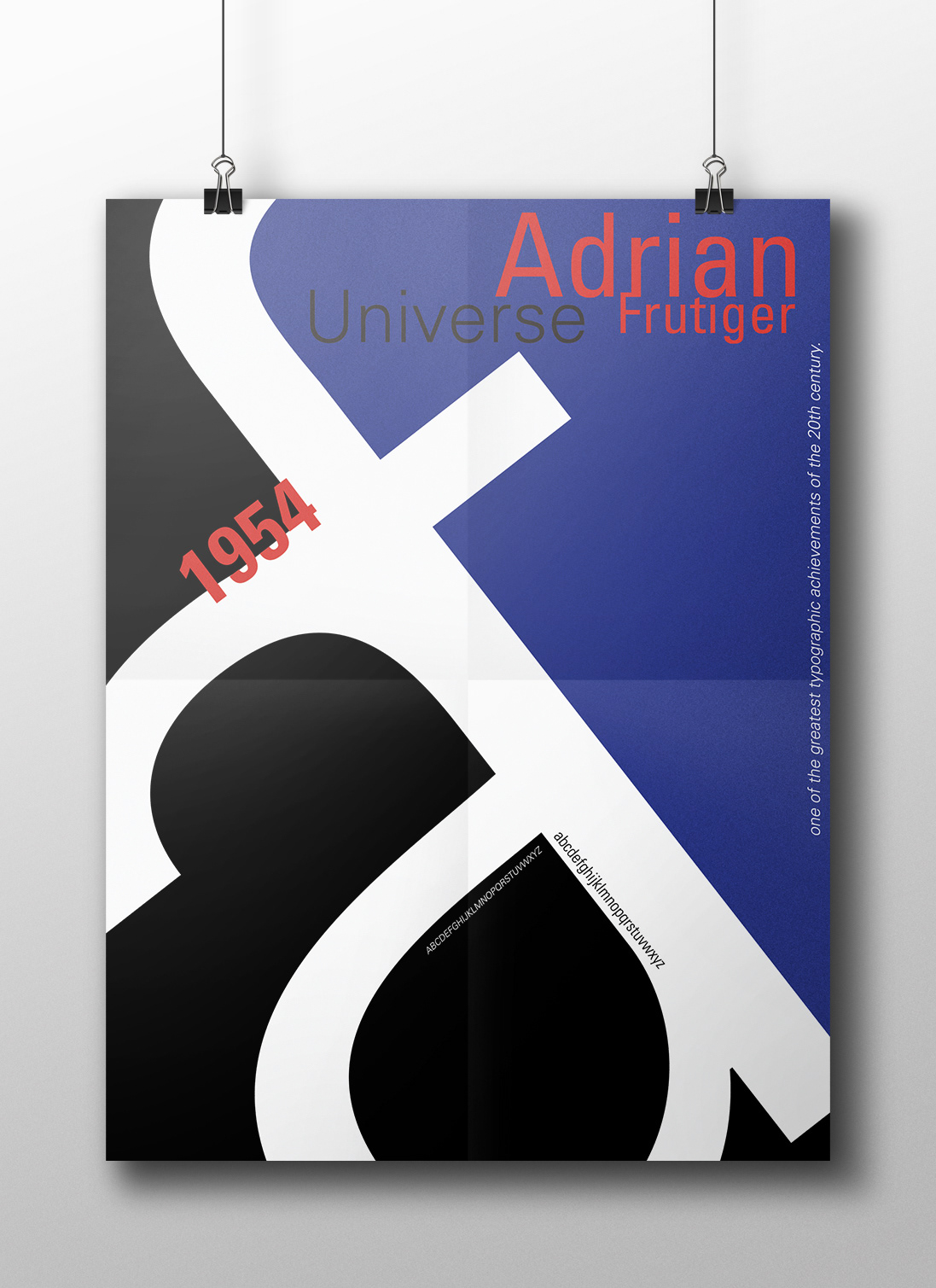